
Colour Psychologist lifts the lid on Love Island decor & how to bring the villa vibe home
From aphrodisiac reds to provocative purples – this year’s Love Island villa design is already turning heads.
With contestants set to crack on after coupling up last night, paint brand Valspar has taken a deep dive into the villa’s hotly anticipated decor reveal, in partnership with expert colour psychologist, Lee Chambers.
Lee explains how colour = connection, shining a light on where the producer’s heads *might* have been at when they briefed the villa’s mega makeover.
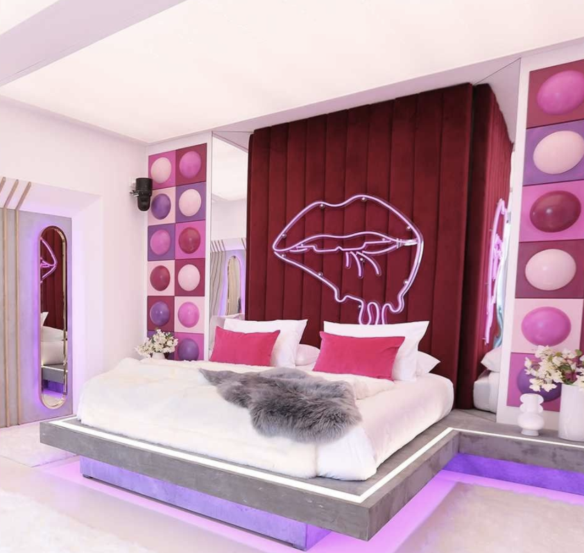
The Hideaway
“It’s no surprise to see bold colours in the Hideaway, as the design fuses the provocative power and royal mystery of purple with the stimulating sexuality of a heated pink. When combined with fiery crimson, which promotes passion, energy and action, on a clean backdrop of pure and innocent white, the colour is popping – and the romance will be too.”
At the villa’s entrance, Lee suggests “softer pastel hues create a sense of calm, which will be welcoming in both the excitement and anxiety of entering the villa. Equally, the colour palette evokes confidence, giving those who enter an assertive platform to walk in and turn some heads.”
In the living area, Lee notes the vibrance of the pink will bring “a social energy and encourage islanders to get conversation flowing. The electric blue accents of the bunnies and decoration are there to promote that calm confidence in anyone who’s feeling just a little shy. The symbolism of bunnies, bananas and hearts cannot be discounted; alongside the energetic colours, they clearly scream for some quick coupling up.”
“And don’t forget the associations we have with neon colours, as they often take us back to our childhoods” Lee says. “Expect a few of the lads to become seven year old boys, incredibly curious, asking lots of questions and pranking each other.”
“If we take a closer look at the design this year, everything is dripping. The bananas, the hearts and lips. It is subliminally suggesting that there will be plenty of melting going on, and some fluidity in the relationship and friendship dynamics throughout the show. (And probably some snake-like behaviour being perpetrated, too.)”
He adds: “It certainly gives permission for boundaries to be pushed when outlines are being melted away. The bananas also amplify the vision of eating and having a snack, but it’s not exactly a three course meal.
The villa’s design could be 100% your type (not on paper), thanks to Valspar’s expert colour mixing technology, which can match the exact shade of anything you see on the show.
Whether you’ve got your eye on the new poolside perches or bedroom break out spots, it’s easy to bring the Love Island look home, and maybe even recreate a Hideaway of your own.
Lee’s Top Tips on how to couple up with colour this summer:
Bring energy to entertainment spaces with blue and citrus hues
Entertainment spaces are the best spots in the home to have fun and be brave with styling. You can afford to be bold in areas where you typically do more entertaining, so consider energising and flirty shades like Blue Grotto and Bees Knees – perfect for parties!
Pair Love Island brights with brilliant white for Balearic bliss
For those looking to bring the love island look home in a more understated way, consider balancing bolder colours with clean, muted shades. To create a bright space that still feels soft and cosy, select whites with warmer undertones such as Valspar’s Anything Goes or Coronation Gown and pair them with deeper hues or dusky pastels like Icy Fresh and Alpine Forget-Me-Not – as seen in the entrance of this year’s villa.
All over colour not your vibe? Flirt with your favourite shades instead
If all over colour isn’t your thing, consider using your chosen shades sparingly to create accents in a few choice areas, such as a windowsill or one feature wall. Accents are a great way to create points of interest within a room, so really consider the space and the aesthetic you have in mind before making your decision.
All about accessories
Accessories are a great way to weave a colour scheme throughout the room. If you’re opting for a fabulously bright accent wall, look no further than Mad About You to bring the Hideaway look home this summer. Why not also bring out bold colour in other areas of the room – think splashes of red in wall art and soft furnishing like cushions, throws and (if you’re brave enough) a neon lips sign will complete the look.
It’s a (colour) match – secure yourself a date
Valspar knows it can be a challenge to find your perfect paint pairing. Whilst the brand has over 2,000 pre-mixed colours available, those looking to match exact shades from this year’s show need only stop by their local B&Q to test out Valspar’s expert colour matching technology. Simply show our team the colour you want to couple up with and take a tester pot home to try it out for yourself.